To win in a market that is becoming more homogeneous and crowded, Boston Whaler needed a visual identity that clearly differentiated it from the crowd. By tapping into its rich heritage, we reimagined the brand as bold, distinctive, and modern, honoring its history while positioning it for the future. The rollout of the new brand helped lift sales by 13% in the first quarter.
Competitive Analysis
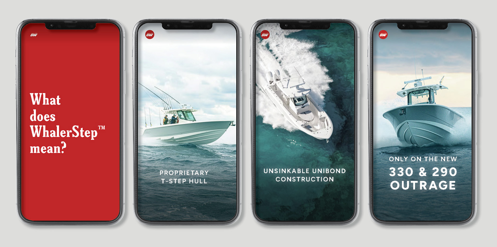
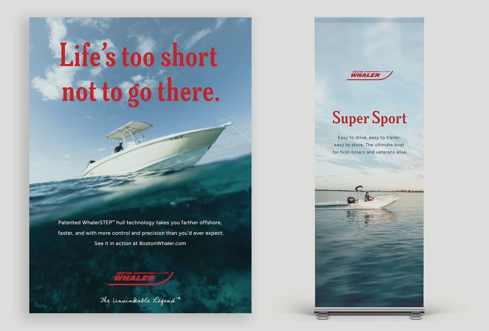
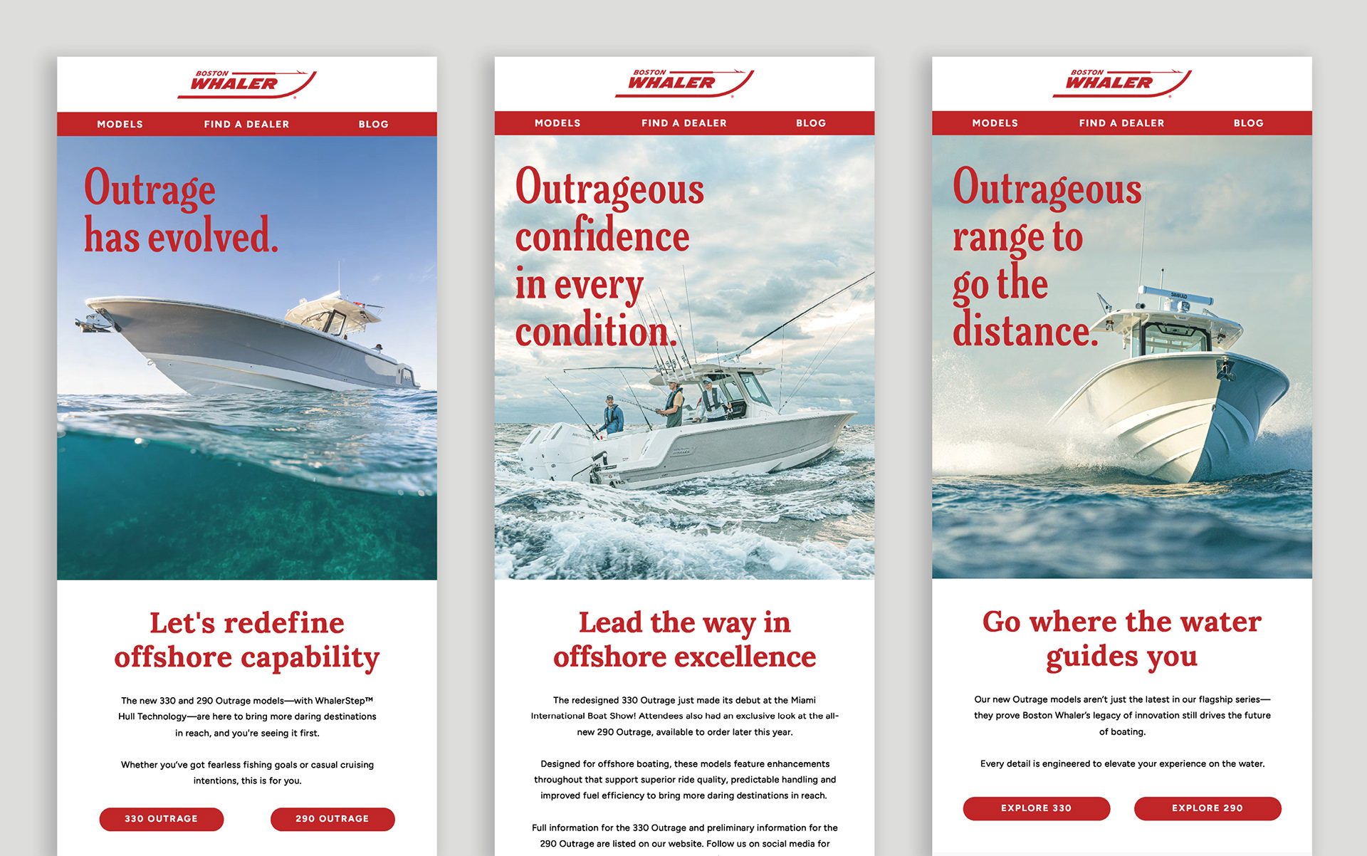
A competitive audit revealed that most competitors rely on similar photography, logos, and blue color palettes, creating a sea of sameness. This insight informed a strategy focused on differentiation through the use of Whaler red as a defining brand element and a unique approach to photo treatment, helping the brand reclaim a more recognizable position of leadership.

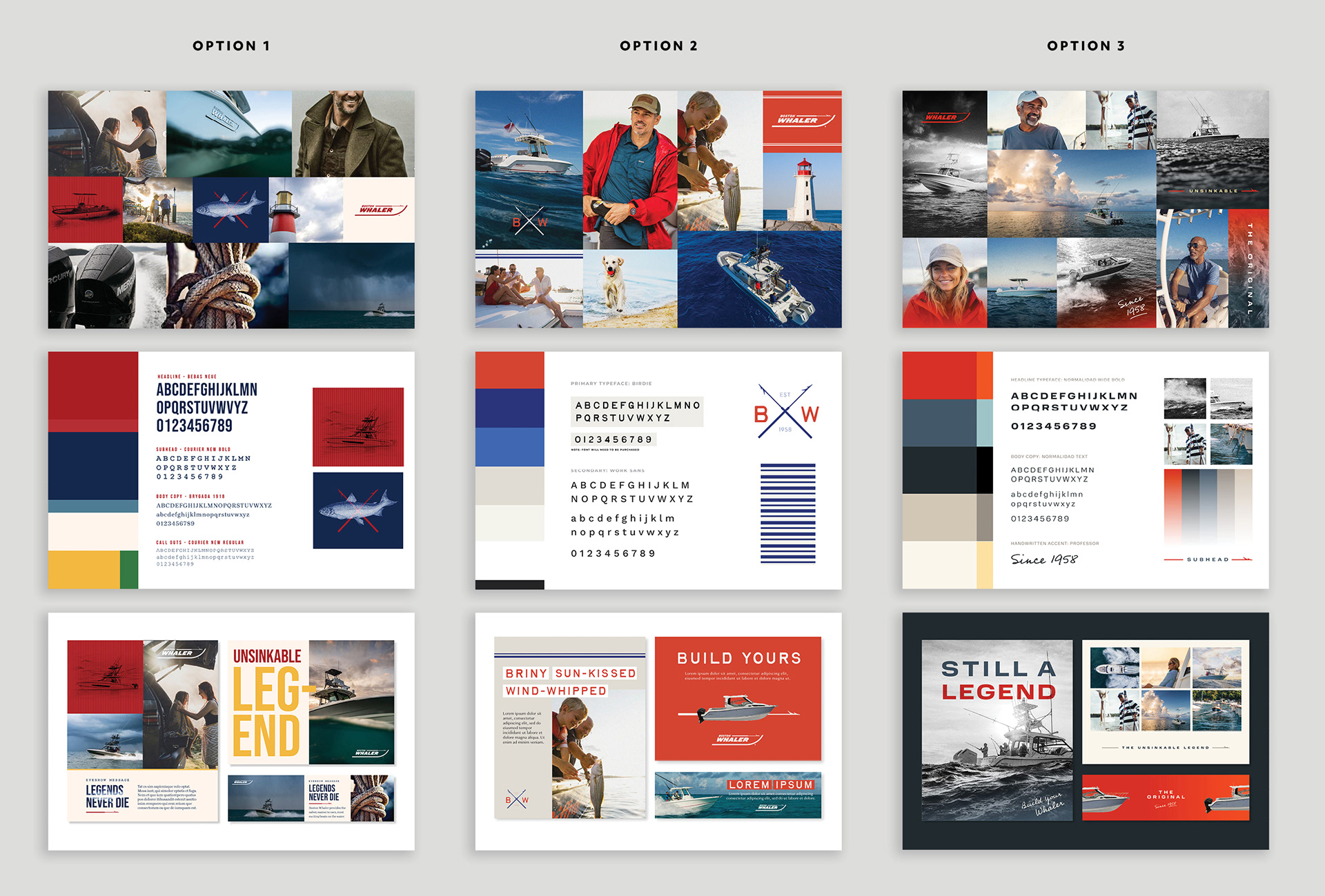
Initial Design Exploration
Rather than reinventing the brand, our approach focused on thoughtful refinement, retaining key elements such as the logo and primary color palette while identifying opportunities for modernization and growth. We developed three visual directions rooted in the same foundations, each offering a unique feel.
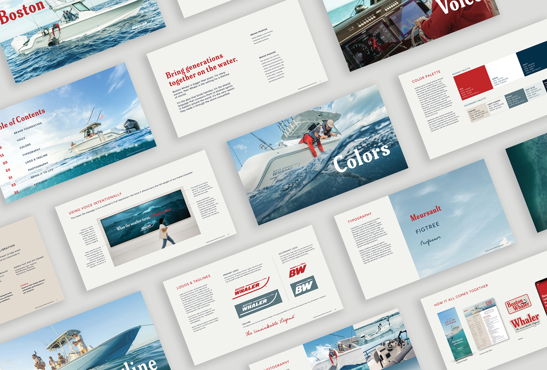
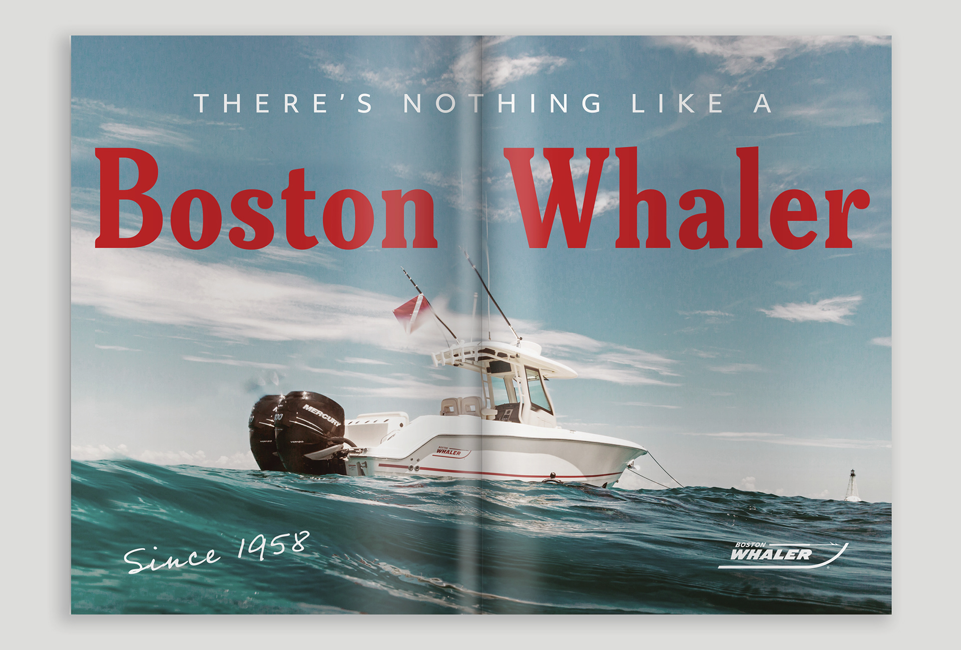
The new brand
Drawing on classic Americana and a modern design approach, the new Whaler brand balances nostalgia with fresh energy. A cohesive system of color, type, and imagery results in a warm, distinctive expression that differentiates Boston Whaler from the competition while staying true to its heritage.


Brand Anthem Video
The new brand was unveiled at the 2026 Miami Boat Show with a redesigned booth experience and a Brand Anthem video. Featuring authentic stories from devoted owners, the film highlights how storytelling keeps the brand’s legacy meaningful and relevant today. It showcased not just the product, but the emotional value behind it, celebrating a legacy that continues to resonate across generations.
Art Director: Sara Brogan | Copywriter: Sarah Greene